Fourth lecture: Importing and plotting data
Contents
A standard .csv contains data as floating point numbers in each row, separated by commas. We can import data from .csv files with the dlmread command. The output will be a matrix, containing doubles. If the file is in our working directory, the input of the dlmread command is simply the filename between apostrophes. For example:
ad=dlmread('adatok.csv');
This file contains data of 20000 people, one person's data in one row. The first column is the height in cm, the second is the weight in kg and the third is the age in years.
Histogram
First we visualize the distribution of the heights with the histogram function.
out1=histogram(ad(:,1));
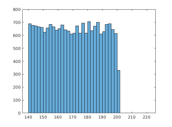
The out1 is a struct type variable. It can contain different types of data. It has so called properties. Each property has a name and can contain identical type of data. For example the BinEdges property stores the boundaries of the intervals (it's a vector), while the NumBins property contains only one number: the number of intervals. The Values property is also a vector, its elements are the number of people whose height is in the particular interval.
The values stored in one property can be reached with the dot, for example:
out1.Values
ans =

  Columns 1 through 13

   690   677   674   667   662   623   657   684   665   640   653   679   642

  Columns 14 through 26

   634   609   617   673   618   695   618   706   635   670   702   610   629

  Columns 27 through 39

   685   689   646   615   331     1     0     1     0     0     0     1     0

  Columns 40 through 41

     0     2
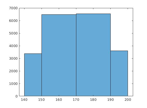
We can change the boundaries of the intervals, in this way we can quickly count how many people's height is between 170 and 190 centimetres.
out2=histogram(ad(:,1),[140,150,170,190,200]);
Boxplot
We can plot our data with the boxplot command. If our data is a matrix, boxplot plots a box for each column. For each box, the central mark indicates the median, and the bottom and top edges of the box indicate the 25th and 75th percentiles, respectively. The whiskers extend to the most extreme data points not considered outliers. The outliers (if there are any) are indicated by a red cross.
boxplot(ad)

Plotting functions
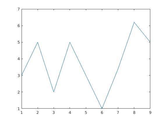
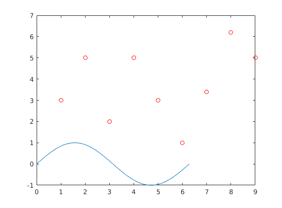
In our first example we plot the elements of a vector. By default we get joined straight lines between our data points. On the x axis we see the position of the element in the vector.
v=[3 5 2 5 3 1 3.4 6.2 5];
plot(v)
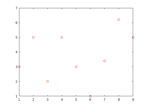
We can specify the style of the line and the markers. Between apostrophes: the first character refers to the colour, the other characters refer to the marker/line type.
plot(v,'ro')
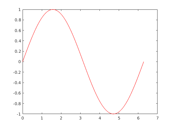
If we want to plot a function, we have to define two vectors: one for the x coordinates and one for the y coordinates.
t=linspace(0,2*pi);
plot(t,sin(t),'r');
This example has the x axis wrong.
plot(sin(t));

Plotting parametrized curve
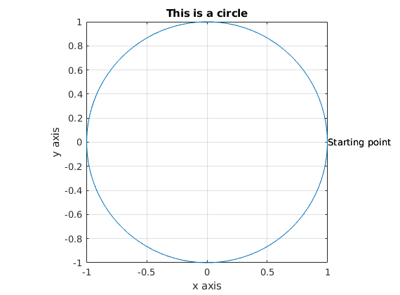
We can also plot parametrized curves, that is, we define the coordinates of the point using a parameter. For example this is a circle:
x=linspace(0,2*pi);
plot(cos(x),sin(x))
text(cos(x(1)),sin((x(1))), 'Starting point');
xlabel('x axis')
ylabel('y axis')
title('This is a circle')
axis('equal','square')
grid on;
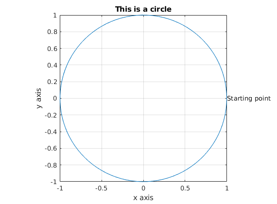
We can add text to our plot. Also, we set the axis to equal, otherwise we end up with an ellipsoid (depending on the resolution of the display).
text(cos(x(1)),sin((x(1))), 'Starting point');
xlabel('x axis')
ylabel('y axis')
title('This is a circle')
axis('equal','square')
grid on;
Multiple functions on one plot
We can put multiple pairs of vectors inside one plot command. Each pair has to contain two vectors of the same length, but different pairs can have different lengths.
plot(0,0,'r+',sin(t),cos(t));

We can also give multiple plot commands. By default, the second plot command erases our plot, but by setting hold on, Matlab will draw the second plot on top of the first one.
plot(v,'ro')
hold on
plot(t,sin(t))
We can set hold off, or restart Matlab.
hold off
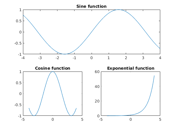
Multiple plots on one figure
t=-4:0.1:4;
subplot(2,1,1);
plot(t,sin(t))
title('Sine function');
subplot(2,2,3);
plot(t,cos(t))
title('Cosine function');
subplot(2,2,4);
plot(t,exp(t))
title('Exponential function');
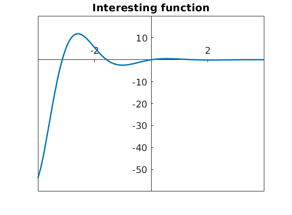
Exporting images
The default font size and line width are usually hard to see, so we increase it first. In this example we also changed the axis location.
We can save our plot in multiple formats: pdf, jpg, eps, ...
figure
plot(t,sin(2*t)./exp(t),'LineWidth',2)
title('Interesting function')
ax=gca;
ax.XAxisLocation = 'origin';
ax.YAxisLocation = 'origin';
set(gca,'fontsize',14)


saveas(gca, 'abra.jpg')
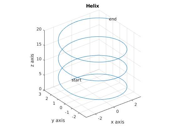
Plotting in 3D
We can draw a parametrized curve in 3D with the plot3 command.
x=0:0.1:20;
plot3(3*sin(x),3*cos(x),x)
text(3*sin(x(1)),3*cos(x(1)),x(1), 'start');
text(3*sin(x(201)), 3*cos(x(201)),x(201),'end');
xlabel('x axis'), ylabel('y axis'), zlabel('z axis')
title('Helix')
axis('equal','square')
grid on;
With the mesh command we can plot a surface over a rectangular grid. We defined the edges of the grid first:
x=linspace(-3*pi,3*pi);
y=x;
The meshgrid command creates the grid (in the xx variable the are the x coordinates of each point):
[xx,yy]=meshgrid(x,y);
We have to calculate the values of the function over the grid:
z=sin(xx+yy);
And we can plot it with the mesh command
mesh(x,y,z)

Recommended problems
Try to avoid usingloops!
1. problem: Plot the distribution of the bmi indices (weight in kg / height^2 in meters) according to the adatok.csv file. Find out, that * How many people have bmi under 18?
- How many people have bmi over 25?
- How many people have bmi between 18 and 25?
2. problem: Answer the questions above for people under 30 years.
3. problem: Try plotting the A=[3 4 2 3; 1 3 5 1; -9 5 2 5] matrix. Explain what you see on the plot.
4. problem: Plot the parametrized curve x(t)=t*cost(t), y(t)=t*sin(t) where t is between 0 and 10. Label the axes, give your plot a title and save it as a jpg file.
5. problem: Write a function called funSign, which takes two numbers as input: a and b. The function should plot the sine function on the [a,b] interval, and its output should be 1 if the sign of the sine function is different in the point a and b, 0 if any of a or b is a root, -1 otherwise.
6. problem: Plot a half sphere.